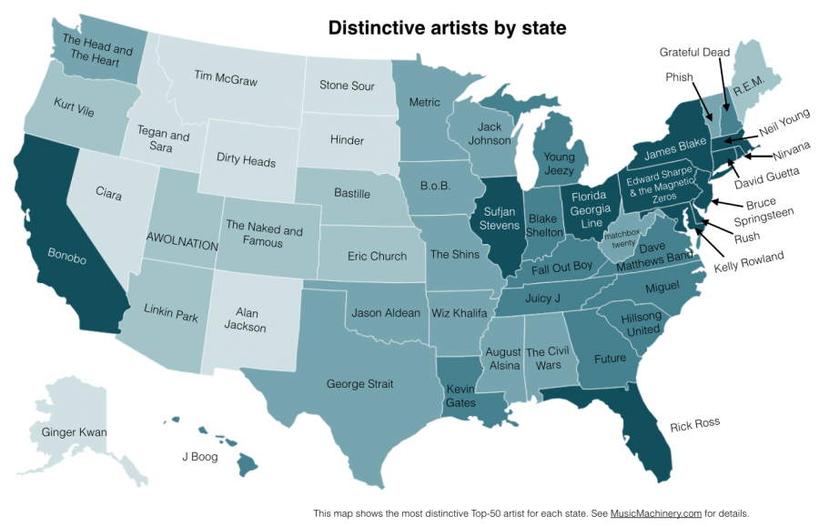
Are you streaming music right now? If you’re in America’s Pacific region, there’s a much better chance you’re nodding along with Cat Power rather than grooving to Fantasia, which you’d be more likely to be doing if you were across the country in the South Atlantic. Those observations come from a map titled “Regionalisms in U.S. Listening Preferences.”
The map was created by Paul Lamere, who seems to have been caught by surprise by the popularity it gained after he posted it this week. And while he admits in the comments section of that post that there might be ways to improve his map, he certainly started an animated conversation with it.
“Yesterday I spent 45 minutes making a map to accompany a blog post, today I spend all day answering questions about it,” he tweeted. He later added, “Any second now I expect I’ll be getting a call from Seventeen Magazine for a photoshoot.”
The map caused a stir as people shared it on Facebook and Twitter. In discussing how their home state did, many also talked about the relief or disbelief the map inspired in them.
Those who were frustrated – “R.E.M.’s not from Maine!” “I’m from South Carolina and I’ve never heard of Hillsong Unlimited!” – might not have realized that despite appearances, the map depicts artists that distinguish states and regions from one another. That is to say, it doesn’t list your state’s most popular musical act; it lists the act that sets your state apart from all the others.
That point was lost on some folks, who were pushed down a confusing path by headlines that promised to reveal “Your State’s Favorite Music” or something along those lines.
Lamere is the director of developer platform at The Echo Nest, a tech company that works with streaming music services such as Rhapsody, SiriusXM, iHeartradio, and Rdio.
The findings “are based on the real listening behavior of a quarter million actual online music listeners,” says Marni Greenberg, the communications director for The Echo Nest. The map reflects the choices of listeners who have zip codes associated with their accounts.
And they emphatically do not reflect the popularity of artists in states. Instead, the data aims to reveal the differences in preference among states and regions.
Here are the five states whose assigned musical act was comparatively unloved by the rest of America:
- Alaska: Ginger Kwan (No. 33 vs. No. 12,062, for a gap of 12,029)
- Hawaii: J Boog (No. 40 vs. No. 4,703 for a gap of 4,663)
- Louisiana: Kevin Gates (No. 15 vs. No. 1,359 for a gap of 1,344)
- Wyoming: Dirty Heads (No. 48 vs. No. 1,334 for a gap of 1,286)
- South Dakota: Hinder (No. 42 vs. No. 1,154 for a gap of 1,112
One thing that might have helped to confuse some folks is that for some states, the map reflects what you might expect. George Strait represented Texas, for instance, while Bruce Springsteen’s name was on New Jersey and Phish was in Vermont. But in other cases, names seemed out of place.
Among the findings, the artist with the smallest gap between their appeal in a state and nationally was Sufjan Stevens, who (as you might expect) was big in Illinois, at No. 38. But he’s also doing well nationally, coming in at No. 68 for a gap, or “delta,” of only 30 spots.
As Lamere points out, he used several rules to populate the map. For starters, the acts must have music available on the streaming services whose data he consulted. He restricted the list of candidates to the top 50 artists in the target state.
And there could be no repeats. If two or more states all listen to the same artist, the one with the largest population got the name, while the others slid down to their second – or possibly far lower – choice.
For example, we can look at Washington, D.C., which doesn’t seem to be on Lamere’s map but is in an app that allows comparisons between states, regions, or the nation as a whole. With that in mind, we’re told people in D.C. would be more likely to listen to Phosphorescent, because the artist is ranked No. 44 in the district and No. 189 in the U.S.
And in an interesting twist on the metrics, Lamere’s tool lets us look at things from the other side of the prism, as well. The biggest gap between what’s popular nationally and what’s hot in D.C. exists in the person of Luke Bryan, we’re told. He’s at No. 48 in the U.S. but only at No. 647 in the district – a gap of 599 spots. Chris Brown and R. Kelly are next in line, with gaps of 121 and 99, respectively.
We should note that in our tinkering with the music app we’re using the default setting of 200 spots for “depth.” If you change that — dipping into a deeper well of music, essentially — you would probably get different results.
9(MDAxNzk1MDc4MDEyMTU0NTY4ODBlNmE3Yw001))


