
Robert Draper’s story on the cover of this Sunday’s New York Times Magazine tackles libertarians—that spunky band of scalawags presently at risk of swiping the keys to the G.O.P.’s Buick. Tasked with whipping up a cover design for the story, the magazine’s art department sought something edgy, something nonconformist, something… Ian MacKaye.
The result is a cover that borrows its cobbled-together aesthetic from D.C. hardcore.
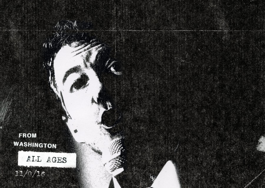
With oversight from the magazine’s Gail Bichler and Kimberly Sutherland, illustrator Matt Dorfman assembled the black-and-white design, which depicts Kentucky Senator Rand Paul as a punk-rock figure clutching a mic. The headline? “Major Threat.” (It’s not intended as a reference to that ill-advised Nike campaign of the same name.)
The rock imagery makes more sense when you read the story’s lede, which quotes ex-MTV VJ and prominent libertarian Kennedy comparing lib leaders to ’90s grunge bands. To Kennedy, Ron Paul is Nirvana, Rand Paul is Pearl Jam, and Ted Cruz is—wah wah—Stone Temple Pilots.
Not that Rand Paul is supposed to closely symbolize either Eddie Vedder or Ian MacKaye. “I don’t know if it can be taken that literally,” says Bichler, the magazine’s art director. Her department wanted to appropriate the language of D.C. hardcore in order to “give the sense that Republicans could make use of [libertarians’] oppositional, youthful energy.” The piece’s Washington link made it seem like a natural choice. “We thought because it’s a D.C.-based story, we wanted to play off the language of D.C. hardcore,” Bichler says.
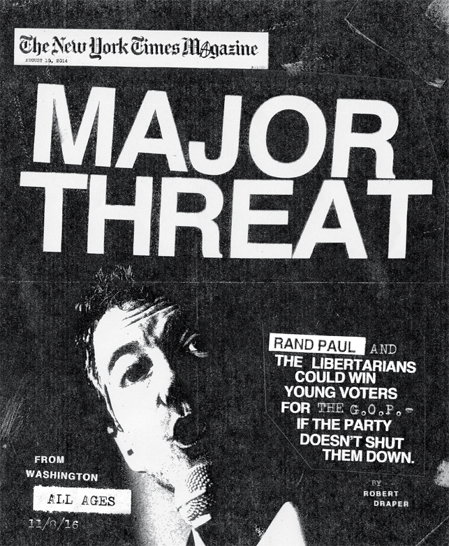
Dorfman didn’t take shortcuts trying to punk up the visual. Cribbing inspiration from a 1980s Fugazi poster and a Dead Boys poster from the late ’70s, Dorfman made most of the cover by hand with help from a Xerox machine, Bichler says. Then he added details like tape marks and text punched out on a typewriter. In the lower left corner, the cover reads “ALL AGES” and “11/8/16”—the date of the next presidential election. (Don’t let that give you ideas, kiddos; you still can’t vote till you’re 18. Though some libertarians would like to change that.)
When Dorfman brought his drafts back to the team, Bichler and Sutherland advised him to keep it real. “He would show it to us, and sometimes our input would be, ‘Make it look worse! It’s not quite crappy enough,'” the art director says.
But while the design crew did a swell job making the cover as distinctly crappy as possible, there’s another key element that’s subtle by comparison. It’s the little anarchy symbol tucked away in the magazine’s nameplate. Bichler says she had to run that one up the chain first. “Anytime you touch the logo, it’s a little bit touchy,” she says. Ultimately, it got approval from the Times higher-ups.
Bichler calls the circle-A her favorite component of the design. “We were trying to make an editorial point,” she says, “and it definitely makes it more authentic with that.”
This post has been corrected to reflect that Matt Dorfman designed the cover himself with art direction from Gail Bichler and Kimberly Sutherland.
Pingback: Arts Roundup: Never Leaving Edition - Arts Desk()
Pingback: District Line Daily: Streetcars’ Slow Roll - City Desk()
Pingback: Maybe Rand Paul Took That 'Snapchat Election' Thing Too Seriously | Slantpoint()
Pingback: Maybe Rand Paul Took That 'Snapchat Election' Thing Too Seriously | Slantpoint Democrat()
Pingback: Maybe Rand Paul Took That 'Snapchat Election' Thing Too Seriously - LiberalVoiceLiberalVoice — Your source for everything about liberals and progressives! — News and tweets about everything liberals and progressives()
Pingback: Maybe Rand Paul Took That ‘Snapchat Election’ Thing Too Seriously | USA News Today()
Pingback: Maybe Rand Paul Took That 'Snapchat Election' Thing Too SeriouslyUpdates News | Updates News()
Pingback: Maybe Rand Paul Took That ‘Snapchat Election’ Thing Too Seriously | EuroMarket News()
Pingback: Maybe Rand Paul Took That ‘Snapchat Election’ Thing Too Seriously | Omaha Sun Times()
Pingback: Maybe Rand Paul Took That 'Snapchat Election' Thing Too Seriously - Chicago Times Post()
Pingback: Maybe Rand Paul Took That ‘Snapchat Election’ Thing Too Seriously | Las Vegas Times Post()